Inside the Macworld Vault: A hidden collection of vintage Macs

July 30th, 2015 | Edited by | hardware

Jul
30

A hidden collection of vintage Macs

A lot of Apple hardware has passed through the halls of Macworld. Over time, old hardware gets donated to charities and schools. But sometimes an item is put into storage, thinking that there might be a use for it down the road. More often, though, that item is forgotten about.
I was recently asked to sort through Macworld’s storage, and I ended up taking a fun trip through memory lane. I documented much of it on my Twitter andInstagram feed, but we’ve also decided to post pictures here.
Sit back, relax with a tasty beverage, and enjoy the photos. More importantly, share you Mac stories in the comments section. Also, if you enjoy coverage of vintage Apple products, be sure to check out Christopher Phin’s Think Retrocolumn.

Pyramid of Mac towers

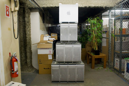
This is a combination of G5 Power Macs and 2008 Mac Pros. Apple used this basic tower design for over seven years. Apple is so focused now on lightweight, small computers, and the aluminum tower was everything but lightweight and small.
With that in mind, here’s a disclaimer: Do not attempt to build your own pyramid of aluminum Mac towers. They are heavy machines, and lifting one above your knees is a difficult task. That tower up top? It nearly fell on my head when I tried to place it there. (The things I do for you people.) I really don’t want to hear about Mac enthusiasts inspired by this picture who were crushed by an avalanche of G5 Power Macs and Mac Pros. Don’t do it.

pyramid-of-mac-towers

Wallstreet PowerBook

This Macintosh PowerBook G3 was code-named Wallstreet. Two things that struck me about this laptop as I inspected it some 17 years after its release: I really like the feel of its keyboard, and the six-color Apple logo under the screen (which, according to Wikipedia, was the last time Apple used this logo on its hardware).

MacBook Air and Wallstreet

Sitting on top of the Wallstreet PowerBook G3 is a 13-inch MacBook Air (which wasn’t in storage). I wanted to see how many MacBook Airs I could stack before it equaled the height of Wallstreet. But I got distracted by the next laptop…

Pismo PowerBook

The Pismo PowerBook came a generation after the Wallstreet PowerBook G3. It was the last G3 laptop.

Titanium PowerBook G4

See the broken hinge on this Titanium PowerBook G4? This laptop was in bad shape. I used a similar machine during my stint as a MacAddict/Mac|Life editor. Good laptop.

iBook G4

This one is white. Or it was white.

Macintosh SE FDHD

No vintage Mac collection is complete without an original Mac 128K. But we don’t have one, so I guess that makes our collection incomplete. We do have a Mac SE FDHD, though. My first Mac was a SE FDHD, which I bought while in college.

Graphite iMac

The graphite iMac was part of the third generation of the iMac line. This was the first model to have a slot-loading optical drive.

Flower Power iMac

There’s a Bondi Blue iMac in storage, but I was too distracted by the Flower Power iMac to take a picture of it. I did not find a Blue Dalmatian iMac, however.

eMac

The flat-panel iMac made its debut in 2002. The CRT-based eMac was released soon afterward. It was a more affordable all-in-one made available through education channels.

iMac (Flat Panel)

In 2004, I was hired as Reviews Editor for MacAddict. During my first month there, I attempted to upgrade the RAM in a 17-inch flat-panel iMac. (I never liked calling it the “sunflower” iMac or the “iLamp.”) I re-assembled it improperly and ended up destroying the computer—which was on loan from Apple. My boss was furious and I thought I was going to be fired, but Apple forgave me.

white imac
iMac G5
I was never a fan of the look of the iMac G5. To me, it made the computer look too much like a kitchen appliance. I still see one or two in public schools today.

Apple mice

I’ve never been a fan of the Apple mouse. It prioritizes style and sacrifices function. It’s a very personal piece of hardware, so everyone has an opinion. Whatever works for you.

Source: www.macworld.com
15 new iOS 9 features that are rocking our world

July 28th, 2015 | Edited by | software

Jul
28

Get excited about the little things

Apple’s newest iOS is far from a drastic overhaul, and that’s OK. Sometimes it’s the most subtle tweaks that have the biggest impact. And iOS 9 proves that. Now that we’ve had the chance to play with the iOS 9 public beta, here are some of our favorite features—both big and small—that have changed our lives for the better. What iOS 9 features are you most excited about?

iPhone

Low Power Mode to squeeze extra battery life

I can’t say enough good things about Low Power mode. I love that it asks at 20 percent and again at 10, and then turns itself back off automatically once you’re charged up to 80 percent. And you can still use almost all the functions of your phone: Wi-Fi, Bluetooth, Location Services, GPS, everything. The screen goes to sleep a little quicker than before (which means I have to keep tapping idly in Alphabears while I’m staring at the screen contemplating my next move), and you can’t use AirDrop or Continuity… but who cares when it means my phone no longer needs a mandatory topping-off every day at around 7 p.m.

Automatically organize your selfies in Photos

A new small tweak to the Photos app in iOS 9 has made it easier to keep all your pics organized, especially if you’re a selfie enthusiast. Photos taken with the front-facing camera get automatically placed ins a “Selfies” folder, while screenshots taken by pressing the Home button and the power button get their own dedicated folder as well.

The sophisticated new San Francisco font

The custom Apple-designed font that was first used on the Apple Watch interface comes to iOS 9. This new San Francisco font is used in Settings, Spotlight search, and in the native apps. You can even choose it as the default font for your iBooks collection. The sophisticated yet easy-to-read font may be subtle, but I sure did notice it from the first time I swiped open the lock screen.

Finally, an intuitive Shift key

I’m really loving the subtitle tweaks made to the standard iOS keyboard—especially the new Shift key. I know, this is far from revolutionary, but it makes it much easier to tell if the caps is turned off or on when your entire keyboard displays the letters in uppercase or lowercase letters.

Go back to previous apps with tiny, new Back button

The Back button rocks my world. If I am in, say, Twitter, and I get a notification from Instagram, I can tap that notification, switch to Instagram, tap all around inside Instagram, and still get back to Twitter with one tap. Sure, I could do that before with the application switcher, but the back button is a lot more obvious.

Sharing content into Notes is a game-changer

The Notes share sheet is a game-changer, letting you embed websites, maps, and photos in a to-do list. Once third-party apps support the share sheet, your notes will become richer and more useful than ever before.

Siri is now your new personal DJ

In iOS 9, Siri’s gotten a lot smarter. Not only does Siri serve up information about the weather or different directions, but she can answer complex queries now like, “Show me photos from last summer.” The most exciting part, however, is how well she knows my Apple Music collection. You can ask Siri to play a specific artist, playlist, or “the hottest songs from 1986.”

Want to change your Settings? Just search!

A searchable Settings app is another new feature that’s so small, yet so incredibly helpful that I don’t know why Apple hadn’t included it before! Instead of pouring through each individual setting to find what I want to adjust, I can now just do a quick Spotlight-esque search to find what i need.

Drive, walk or take public transportation

For years, Maps users had to rely on third-party apps to get reliable public transportation directions. Now anymore. Finally iOS 9 includes Transit view which incorporates subway and bus schedules/routes. Transit, however, is only available in select cities: Baltimore, Chicago, New York, Philadelphia, San Francisco, Washington, D.C., Mexico City, London, Berlin, Toronto and 300 cities in China.

Spotlight is better (but beta)

I’m feeling the new Spotlight screen, but it needs to get a little more reliable. I use search to launch apps quite frequently, so I love that the screen is starting to guess which app I might be about to search for—and it does seem to give me different apps for different places and times. (Twitter, HipChat, Pocket Casts, and transit apps during the day. Instagram, Kindle, Two Dots, and Music in the evenings.) It doesn’t always surface the thing I’m looking for on the first try: I searched for Apple to find the Apple Store app, and it wasn’t in the results at all—no Apple apps were. But then I did the search again, and Apple Store was the first result. That’s livin’ la vida beta for you, but I’m optimistic that it’ll keep improving over time and with more use.

iPad only: Easy editing of long chunks of text

With iOS 9, you can place two fingers down on the keyboard and it instantly becomes a trackpad, letting you select large chunks of text with one swipe. The new tools on the QuickType bar help you format the text or cut/copy/paste it with one tap. I’ve never thought of the iPad as a viable replacement to my MacBook—until now.

Integration with Apple Watch Activity achievements

For Apple Watch wearers only: It’s pretty neat how the achievement medals in the Activity app are engraved with the date you earned them. Just swipe one with your finger to flip it over! It’s a tiny change, but I got a kick out of it.

Cool-looking articles are easy to find in News

A few publishers are adopting Apple News Format to create really cool articles in the News app with big images, animations, and videos. Luckily, it’s easy to find all these articles by subscribing to the Apple News Selections channel. So far in public beta, there are only a handful of articles in this format, but I’m expecting this section to blow up come the official release of iOS 9 in the fall.

iPad only: Picture-in-picture offers much-needed distractions

Back in school did you ever hide a comic book inside a textbook to give the impression you were studying? iOS 9 gives the iPad a similar function withpicture-in-picture. Now you can research a work project while watching Cartoon Network at the same time.

Feedback app makes it easy to report beta bugs

Beta users automatically get a Feedback app for submitting bug reports to Apple. That’s awesome, but can it please stick around when the beta is over? It’s easy to use, and since the reports are sent with crash logs and other device-specific info, they’re probably more useful to Apple than whatever we could submit through thebugreport.apple.com site.

Source: www.apple.com

Inbox by Gmail adds some extra smarts to the snooze button

July 25th, 2015 | Edited by | software

Jul
25

Google’s email app now looks at message content to predict just the right time to pop messages back into your inbox.

inbox_image

Inbox uses the data contained in your emails to help you organize. And today, it’s got a little better at it. Google’s Gmail app alternative now tries to predict when messages you snooze should return.
For example, if you snooze an email with a restaurant reservation, Inbox will offer to summon the message an hour before your dining time (see below).
Google is making the tweak on its own end, so no need to get an app update from the Play Store. Along with restaurant reminders, Google says you’ll see the new Snooze capabilities with package tracking updates, calendar invites, flight confirmations, hotel bookings, and rental car reservations.
The story behind the story: Most of the innovation around Gmail is taking place in Google’s Inbox app. Other Inbox tricks include automatic travel itineraries and message bundles, so you can banish them to the archive or trash instantly. Inbox is definitely worth a try if you get a lot of email or want Google’s help with timely reminders.

Source: www.macworld.com

Whoops: Cortana for Android leaks out early

July 23rd, 2015 | Edited by | software

Jul
23

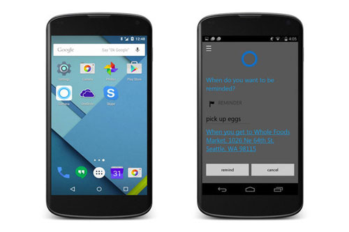
A beta of Microsoft’s digital assistant for Android surfaces before its official launch later this month.

cortanaonandroid

If you’ve been eagerly awaiting the arrival of Cortana for Android, today’s you’re lucky day. According to Finnish tech site SuomiMobiili (via Unofficial Microsoft News), a prerelease build of Microsoft’s digital assistant for Google’s mobile OS leaked out Friday and has been illicitly made available for download.
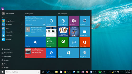
Unofficial Microsoft News says the leaked build is “functional” and that it has all the features you can expect from Cortana on Windows 10, so it would seem to be a pretty direct port of the software.
The story behind the story: Microsoft announced Cortana for Android last month, with a goal of releasing it sometime in July. By releasing Cortana for Android, Microsoft will take another step toward fulfilling CEO Satya Nadella’s vision for the company—that is, to provide productivity tools to as many customers as possible, even if they’re using a competing platform like Android. Whether Cortana offers enough to sway Android users away from Google Now remains to be seen, but you can’t fault Microsoft for trying.

Proceed with caution

If you decide to take it for a spin, keep in mind the leaked version of Cortana is still a beta—and one that wasn’t necessarily intended for public consumption—so you may encounter bugs along the way. If you’d rather play it safe, stay tuned for our hands-on next week, and we’ll let you know how it worked for us.

Source: www.pcworld.com

Microsoft makes it official: Windows 10 will receive security fixes for ten years

July 21st, 2015 | Edited by | software

Jul
21

The company will offer “mainstream” support for its upcoming OS until 2020 at the earliest, and “extended” support until at least 2025.

windows-10

Back in January, Microsoft first stated that Windows 10 would be free for the “supported lifetime of the device” you install it on. That wording caused some confusion: What the heck is a device’s “supported lifetime,” anyway? But we’re now getting a better idea of what you can expect in terms of Windows 10 support.
According to an updated support document published to Microsoft’s site, the company will offer “mainstream support” for Windows 10 through October 13, 2020, and “extended support” (that is, how long you can expect Microsoft to issue Windows 10 security fixes) through October 14, 2025.
For those keeping score at home, the five-year mainstream support and ten-year extended support periods are more or less in line with the support cycles for Windows Vista, 7, and 8, so you won’t be cut off early, support-wise, with Windows 10.
If your computer is no longer supported by its manufacturer, you should be good to go as well. According to ZDNet’s Ed Bott, you’ll be able to install Windows 10 “even on devices where the OEM does not officially support Windows 10 and has no plans to do so.” Put another way, you’ll still get Windows 10 software updates from Microsoft, even if your PC’s manufacturer no longer offers support for your computer.
Microsoft will release Windows 10 for PCs and tablets to the masses on July 29th, with Windows 10 Mobile following sometime this fall. In the meantime, if you’re on Windows 7 or 8, you can “reserve” your copy now and be notified when Windows 10 is released.

Source: www.pcwprld.com

Page 9 of 29« First...7891011...20...Last »