Apple’s M7 Motion Sensing Coprocessor Is The Wizard Behind The Curtain For The iPhone 5s

September 21st, 2013 | Edited by | hardware

Sep
21

Apple has a new trick up its sleeve with the iPhone 5s that was talked about on stage during its recent reveal event, but the impact of which won’t be felt until much later when it gets fully taken advantage of by third-party developers. Specifically, I’m talking about the M7 motion coprocessor that now takes the load of tracking motion and distance covered, requiring much less battery draw and enabling some neat new tricks with tremendous felt impact.
The M7 is already a boon to the iPhone 5s without any third-party app support – it makes the iPhone more intelligent in terms of when to activate certain features, and when to slow things down and converse battery life by checking less frequently for open networks, for instance. Because it’s already more efficient than using the main A-series processor for these tasks, and because changing these behaviours can themselves also save battery, the M7 already stretches the built-in battery to its upper limits, meaning you’ll get more talk time than you would otherwise out of a device that’s packing one.

iphone-5s_m7_hero

Besides offering ways for Apple to make power management and efficiency more intelligent on the new iPhone 5s, the M7 is also available for third-party developers to take advantage of, too. This means big, immediately apparent benefits for the health and activity tracker market, since apps like Move or the Nike+ software demoed during the presentation will be able to more efficiently capture data from the iPhone’s sensors.
The M7 means that everyone will be able to carry a sensor similar to a Fitbit or equivalent in their pocket without having to cart around a separate device, which doesn’t require syncing via Bluetooth or worrying about losing something that’s generally tiny, plus there’s no additional wristwear required. And the M7′s CoreMotion API is open to all developers, so it’s essentially like carrying around a very powerful motion tracking gizmo in your pocket which is limited in function only by what developers can dream up for it.
So in the future, we’ll likely see gesture-controlled games (imagine the iPhone acting as a gesture controller for a title broadcast to Apple TV via AirPlay), as well as all kinds of fitness trackers and apps that can use CoreMotion to limit battery drain or change functionality entirely depending on where and when they’re being used, as detected by motion cues. An app might offer very different modes while in transit, for instance, vs. when it’s stationary in the home.
Apple’s iPhone 5s is an interesting upgrade in that much of what’s changed takes the form of truly innovative engineering advances, with tech like the fingerprint sensor, camera and M7 that are each, in and of themselves, impressive feats of technical acumen. What that means is that, especially in the case of the M7, the general consumer might not even realize how much of a generational shift this is until they get their hands on one, and new software experiences released over the hardware’s lifetime will gradually reveal even more about what’s changed.

Source: www.techcrunch.com

Samsung SSD 840 EVO Review: 120GB, 250GB, 500GB, 750GB & 1TB Models Tested

September 19th, 2013 | Edited by | hardware

Sep
19

I’m continually amazed by Samsung’s rise to power in the SSD space. If you compare their market dominating products today to what we were reviewing from Samsung just a few years ago you’d assume they came from a different company. The past three generations of Samsung consumer SSDs have been good, but if you focus exclusively on the past two generations (830/840) they’ve been really good.
Last year Samsung bifurcated its consumer SSD lineup by intoducing the 840 Pro in addition to the vanilla 840. We’d seen other companies explore a similar strategy, but usually by playing with synchronous vs asynchronous NAND or sometimes just using different NAND suppliers between lines. Samsung used NAND to differentiate the two but went even more extreme. The non-Pro version of the 840 was the first large scale consumer SSD made with 3-bit-per-cell MLC NAND, more commonly known as TLC (triple-level-cell) NAND. Companies had toyed with the idea of going TLC well before the 840’s release but were usually stopped either by economic or endurance realities. The 840 changed all of that. Although it didn’t come with tremendous cost savings initially, over time the Samsung SSD 840 proved to be one of the better values on the market – you’d just have to get over the worry of wearing out TLC NAND.
Despite having a far more limited lifespan compared to its 2bpc MLC brethren, the TLC NAND Samsung used in its 840 turned out to be quite reliable. Even our own aggressive estimates pegged typical client write endurance on the 840 at more than 11 years for the 128GB model.

SSD Samsung

We haven’t seen Samsung’s love of TLC embraced by other manufacturers. The most significant contrast actually comes from Micron, another NAND supplier turned SSD manufacturer, and its M500. Relying on 2bpc MLC NAND, the M500 gets its cost down by using a combination of large page/block sizes (to reduce overall die area) as well as aggressively embracing the latest NAND manufacturing processes (in this case 20nm). That’s always been the Intel/Micron way – spend all of your time getting to the next process node quickly, and drive down cost that way rather than going TLC. The benefit of the TLC approach is the potential for even more cost reduction, but the downside is it usually takes a while to get production to yield high enough endurance TLC to make it viable for use in SSDs. The question of which is quicker is pretty simple to answer. If we look at the 25nm and 20nm generations from IMFT, the manufacturer was able to get down to new process nodes quicker than Samsung could ship TLC in volume.
The discussion then shifts to whether or not TLC makes sense at that point, or if you’d be better off just transitioning to the next process node on MLC. Samsung clearly believes its mainstream TLC/high-end MLC split makes a lot of sense, and seeing how the 840 turned out last time I tend to agree. It’s not the only solution, but given how supply constrained everyone is on the latest NAND processes this generation – any good solution to get more die per wafer is going to be well received. Samsung doesn’t disclose die areas of its NAND, so we unfortunately can’t tell just how much more area efficient its TLC approach is compared to IMFT’s 128Gb/16K page area efficient 20nm MLC NAND.
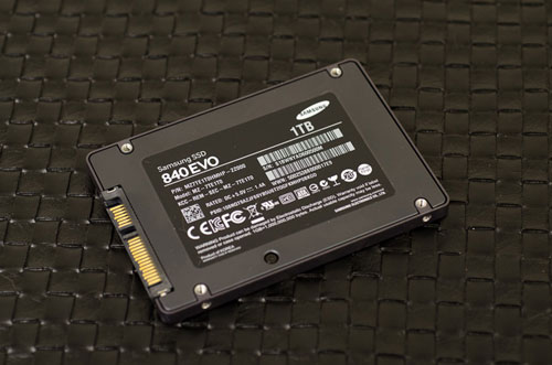
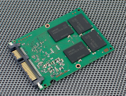
As its name implies, Samsung’s SSD 840 EVO is an evolution over last year’s SSD 840. The EVO still uses 3-bit-per-cell TLC NAND, but it moves to a smaller process geometry. Samsung calls its latest NAND process 10nm-class or 1x-nm, which can refer to feature sizes anywhere from 10nm to 19nm but we’ve also heard it referred to as 19nm TLC. The new 19nm TLC is available in capacities of up to 128Gbit per die, like IMFT’s latest 20nm MLC process. Unlike IMFT’s 128Gb offering, Samsung remains on a 8KB page size even with this latest generation of NAND.

SSD Samsung

The high level specs, at least those Samsung gives us, points to an unwillingness to sacrifice latency even further in order to shrink die area. The decision makes sense since TLC is already expected to have 50% longer program times than 2bpc MLC. IMFT on the other hand has some latency to give up with its MLC NAND, which is why we see the move to 2x larger page and block sizes with its 128Gbit NAND die. Ultimately that’s going to be the comparison that’s the most interesting – how Samsung’s SSD 840 EVO with its 19nm TLC NAND stacks up to Crucial’s M500, the first implementation of IMFT’s 128Gbit 20nm MLC NAND.

Modern Features
Along with the NAND update, the EVO also sees a pretty significant controller upgrade. The underlying architecture hasn’t changed, Samsung’s MEX controller is still based on the same triple-core Cortex R4 design as the previous generation MDX controller. The cores now run at 400MHz compared to 300MHz previously, which helps enable some of the higher performance on the EVO. The MEX controller also sees an update to SATA 3.1, something we first saw with SanDisk’s Extreme II. SATA 3.1 brings a number of features, one of the most interesting being support for queued TRIM commands.
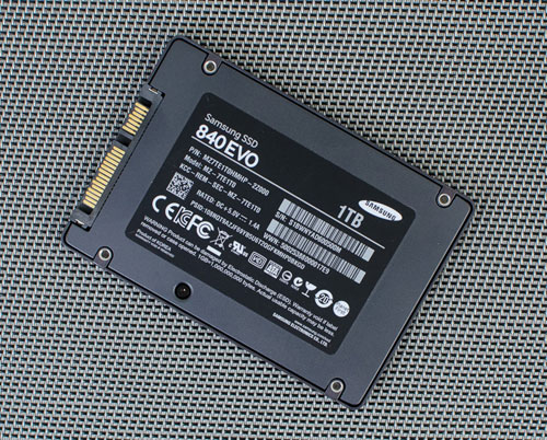
The EVO boasts hardware AES-256 encryption, and has its PSID printed on each drive label like Crucial’s M500. In the event that you set and lose the drive’s encryption key, you can use the PSID to unlock the drive (although all data will be lost). At launch the EVO doesn’t support TCG Opal and thus Microsoft’s eDrive spec, however Samsung tells us that a firmware update scheduled for September will enable both of these things – again bringing the EVO to encryption feature parity with Crucial’s M500.
As one of the world’s prominent DRAM makers, it’s no surprise to find a ton of DRAM used to cache the firmware and indirection table on the EVO. DRAM size scales with capacity, although Samsung tosses a bit more than is necessary at a couple capacity points (e.g. 250GB).
The move to 19nm 128Gbit TLC NAND die paves the way for some very large drive capacities. Similar to Crucial’s M500, the 840 EVO is offered in configurations of up to 1TB.
I’ll get to the dissection of performance specs momentarily, but you’ll notice some very high peak random and sequential performance out of these mainstream drives. The peak performance improvement over last year’s 840 is beyond significant. The keyword there is peak of course.

SSD Samsung

Pricing
Prices are a bit higher than the outgoing Samsung SSD 840, which makes sense since we’re looking at the beginning of the cost curve of a new process node. Crucial’s highly sought after $600 960GB M500 seems finally back in stock just in time for the EVO to go head to head with it. Samsung is expecting roughly a $50 premium for the 1TB EVO over the Crucial solution, but over time I’d expect that gap to shrink down to nothing (or in favor of Samsung). The EVO is considerably more affordable than Samsung’s 840 Pro, and the higher capcacity points are at particularly tempting prices.

Source: www.anandtech.com

Logitech G600 MMO Gaming Mouse

September 14th, 2013 | Edited by | hardware

Sep
14

Remember when a scroll wheel was a big deal? Or when optical sensors replaced scuzzy old mouse balls? And then, in the mid-90s, the unthinkable — a cordless mouse! Surely desktop pointing technology had reached its zenith.
Not so fast. You see, “cordless” and “hardcore gaming” just didn’t mix. Serious gamers prefer a six-foot hardwired tail to the slower response times and battery hassles of the radio-controlled variety. And what about those games that use the entire keyboard? Wouldn’t it be great if someone invented a mouse that would simplify the duties of the left (keyboard) hand? A mouse geared for one of gaming’s brightest stars – the command-crazed world of the MMO?
Enter Razer’s Naga. Debuting in 2009 and refreshed just this year, the Naga has more buttons than a 14-year-old chocolate addict has zits. It was — and is — a spectacular concept and a marvelous bit of engineering that’s found a ton of fans. But it found a few detractors, too.
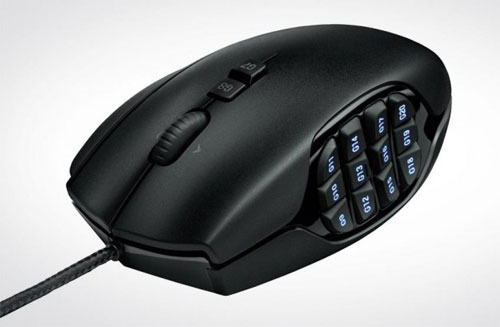
At Logitech, the Naga clearly did not go unnoticed. The company’s new G600 MMO Gaming Mouse replicates much of what made the Naga special — including a plethora of thumb buttons, arranged keypad-style in four rows of three. Then it adds even more enticements to capture the imagination of those who treat their MMOs as gospel.

Features
The G600 features no less than 20 physical buttons — a panel of 12 on its left side, accessed by your thumb; three built into the “tilt” scroll wheel; two more mini-buttons on the very top; and three elongated keys (standard left and right mouse keys and a third “G-shift” key on the far right, directly under your ring finger).
It’s that “G-shift” key that gives the G600 something special. By clicking it, you initiate a shifted state for all 12 of those thumb buttons, effectively doubling their capacity. That’s a (very) grand total of 24 keystrokes available through the 12-button left-side keypad alone. Stunning. All those buttons make the G600 a formidable command center indeed, freeing up the left hand for character movement and the like.
logitech-g600-mmo-black-buttons

There are two ways to configure the G600 for the games you play. Undoubtedly the slickest is via the on-board memory function, through which you can store three complete, unique profiles inside the mouse itself. Indeed, the G600 ships with three preset profiles (two MMO and one suited to general gaming). You can just plug in the USB cable and start living vicariously — no programming or additional hassles required.
By using the on-board profiles, you can feel right at home no matter where you play — a friend’s house, LAN party, the Playboy mansion. Every command remains where it should be.
To see which profile is currently selected, you simply glance at the keypad: It glows in all the colors of the rainbow, and you can assign specific shades to different profiles. You can even get fancy and instruct the lights to cycle or pulse at a given speed. A tiny LED display spelling out in plain English the name of your current profile would have been even cooler, but c’est la vie.
Performance
In action, the G600 proves itself as capable as we’d expect given the stature and track record of its manufacturer. The button array on the left is particularly interesting, shaped so you can generally feel your way around without taking your eyes from the screen. We found ourselves struggling to comfortably reach the back row of buttons, turning our thumb into a pretzel in the process. We do, however, appreciate that Logitech has infused just enough tension into all 12 keypad buttons that you’ll rarely, if ever, accidentally trigger any of them.
Otherwise, the G600 is a “palm grip” rather than “claw grip” mouse, an approach that suits the unique world of MMOs rather well. The G600’s anti-friction pads let it slip and slide equally proficiently on mouse pads and tabletops. DPI options stretching from 200 to 8,200 let you dial in sensitivity to a tee, and you can switch them on the fly.
Yet the G600 is not without its issues. It isn’t, for example, available in a left-handed variant. Whoops, there goes 10 percent of the population. It features a braided rather than plastic-coated cord — a decision that will be applauded by some but will bug those who feel braided cables are stiffer and more prone to fraying. For the record, we feel this braided cable is comparatively soft. Durability, of course, cannot yet be measured.
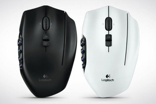
logitech-g600-mmo-black-white

But the big question will undoubtedly be its functionality and usefulness outside the MMO world. And for that, the G600 both impresses and disappoints.
We auditioned it with Adobe’s Lightroom, a pro-level photo-editing application that’s second only to Adobe’s Photoshop for multiple-keystroke shortcuts. We toggled up the Gaming Software utility, entered a new profile, directed the application to the executable (mandatory for all new profiles), and began assigning. In no time at all we’d created a shortcut for full screen view (Ctrl+Shift+F) and assigned it to Button G11 on the mouse. Now, every time we fire up Lightroom, a glorious full-screen perspective is but a single click away. Very nice. We also instructed the pointer to move a little faster within the program than outside it. No problem for the G600.
Unfortunately, it isn’t an ideal all-purpose device. Indeed, it’s far from the best alternative even for action gaming. The big problem? It’s clunky. Compared to Logitech’s G9 Laser Mouse, for instance, the substantially more bulbous G600 is difficult to lift, even momentarily, from the desktop. The keypad makes it feel mushy, and there’s no real finger grip, while Logitech’s still-nifty G9 sports a lovely thumb indent on the left side and better weight balancing.
In fairness, Logitech specifically labels the G600 an MMO mouse. Still, when you’re dropping this much coin ($80 MSRP), you can’t help but hold out hope.
Conclusion
Ultimately, the Logitech G600 MMO Gaming Mouse makes sense only for MMO players, and even then only for those right-handers so deeply obsessed they’ll dole out this much money to gain a small competitive edge. There are other programmable mice out there, many of which won’t bust your pocketbook and aren’t as limiting. So, just how addicted are you?
Highs

  • More commands than a drill sergeant
  • Remembers three entire profiles when unplugged
  • 8,200 DPI sensitivity

Lows

  • Inherent clunkiness impacts “general” mousing
  • Price. $80 for a mouse? Seriously?
  • Lefties banished from the clubhouse

Source: www.digitaltrends.com

A Singapore-first: Sneak peek at Samsung’s GALAXY S4 zoom with LTE

September 12th, 2013 | Edited by | hardware

Sep
12

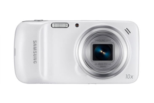
Calling all Android-aficionados, the wait is finally over. The Samsung GALAXY S4 zoom with LTE hits. This is a first for Southeast Asia, and if you are a fan of hybrid devices that offer bang for buck, you might want to give this a gander.
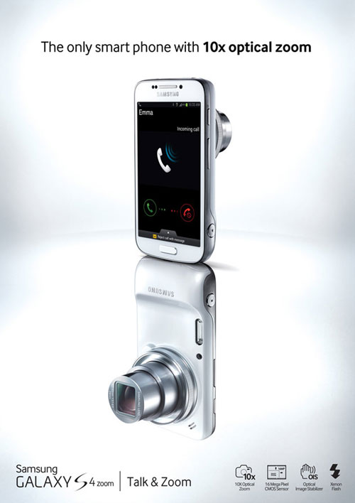
First, let us address the elephant in the room. This is not your average ergonomic smartphone that you slip into your backpocket as you set out for a night out on the town. Some might say it’s a little heavier than would be expected for smartphones today, and a surprising segue from its slimmer predecessors. Weighing in at 208 grams, it is a little hefty. But there is a method to the madness here, because the device is not for the uninitiated. While it offers all the traditional specifications of a phone, another strong ‘sell’ comes in the form of the integrated camera.

GALAXY-S4-zoom

Part of the GALAXY S4 family, the phone is a culmination of Samsung’s bid to create a single device that fulfills the dual roles of smartphone and high-end compact camera at the same time. This addresses a niche in the market that has been largely untapped to date: for the user who wants to document facets of his life on camera, without having to carry an additional device on his person. The product is a foreseeable heavy-hitter for snap-happy fans who want access to the Ethernet stratosphere as well. Melding the worlds of technology and delivering on both ends, Android fans will likely be happy with this latest offering.

GALAXY-S4-zoom1

What you see is what you get
The big draw that sets it apart from counterparts is the 24-240mm optically-stabilised lens. Powered by Android Jelly Beal 4.2, it is also equipped with Touchwiz, for an intuitive, tailor-made mobile experience. Users can enjoy the typical easily-navigated Samsung interface, while capturing precision images with the 10x optical zoom and built-in image stabiliser combined. Adding to that, the 16 megapixel imaging sensor helps you capture pictures from afar, or up close and personal, in different lighting conditions. Resolution is on-point here and the cameras ability to pick up intricate detail is a strong suit as well.
The Samsung GALAXY S4 zoom with LTE also connects users to extensive libraries of images taken by fellow photographers, with ‘Photo Suggest’. This will direct them to an ideal nearby location, for the optimum vantage point – all-important for those Instagram uploads, of course.
Irene Ng, Vice President of Marketing, Samsung Asia Pte Ltd, says the impetus behind this release was clear.
“The Samsung GALAXY S4 zoom With LTE is a true showcase of our efforts to understand what our consumers most need to enjoy the best things in life. As communication becomes increasingly multi-faceted, people are looking for devices which can complement their lifestyles, without having to worry about the inconvenience of bringing multiple devices.”

GALAXY-S4-zoom3

A marriage of technological convenience
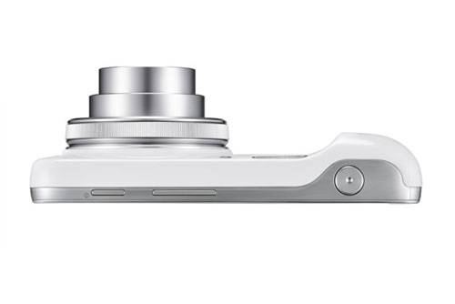
Ergonomic, and offering many easy-to-use features, this is a product that will appeal to novices and current customers alike. However, while it will fit comfortably in the palms of most hands, it is a little ‘clunkier’ than you would expect of a device that delivers on other fronts as it does. In addition, it has beveled sides all around, making it next-to-impossible to stand the camera up on its own – so if you are looking to take a quick picture this week, you are out of luck. An interesting oversight, considering the focus on the camera here. Perhaps a little tweaking is ahead for Samsung, with the next generation of this device.
In the meantime, the Samsung GALAXY S4 zoom with LTE offers go-to options that integrate convenience with being on-the-go. For example, when in the midst of taking a call and you come across something you absolutely have to take a picture of and share, that is not an issue. A quick twist of the camera’s ‘zoom ring’ will activate the in-call photo-sharing feature. This is an intuitive addition that users will find circumvents the traditional, more cumbersome options on the market.
Ultimately, this is a solid smartphone-camera marriage. But whether it is one that will go the distance and find resonance with potential users remains to be seen. However, hit or miss, for the good folks at Samsung, this is another one in the can that delivers more than it falls short.

Source: www.sg.news.yahoo.com

AOC E2462VWH monitor

September 10th, 2013 | Edited by | hardware

Sep
10

A budget 24-inch monitor, but are its pictures up to scratch?
Props to AOC for making an effort. It wasn’t that long ago that pretty much every AOC panel out there looked like it was hewn from pressed plastic sweepings taken from the Airfix factory floor. They certainly looked cheap. The cheerful bit? Not so much.
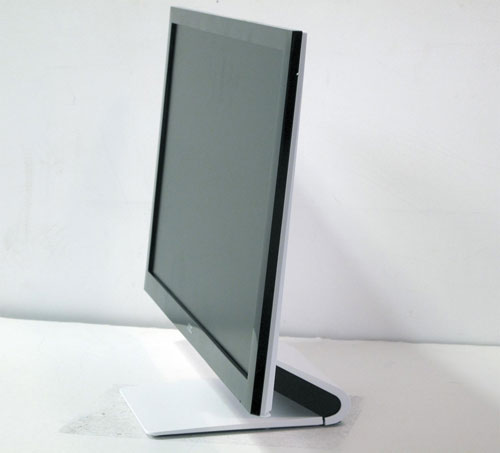
But now there’s this new 24-inch effort. Okay, on close inspection you’re not going to confuse it with a premium panel. The plastics are pretty coarse and the snap-in panel that curls around the rear of the stand will make your teeth itch if slightly mismatched panel gaps and a broader sense of tactility are things that bother you. But the look is certainly pleasantly contemporary. It’s pretty snazzy for a monitor costing £131, that’s for sure.
The main downside of the styling-led design is that it restricts you to height and tilt adjustment. Then again, at this end of the market, tilt-only is usually your lot. If anything, AOC is a little ahead of the game by that metric.

e2462vwh-aoc

No oil painting
Anyway, what about the image quality and features? We’re talking about 24-inches of TN technology and the inevitable 1,920 by 1,080 resolution that comes along with it.
Now, it’s certainly true that in the past we’ve been pretty down on TN panels. Part of that was due to the inherent shortcomings of TN tech. Poor viewing angles, dodgy colour reproduction, iffy blacks and contrast – that sort of thing. Our dim view of TN panels was also down to choice. There simply wasn’t any.
Things are different now, what with a new generation of more affordable IPS arriving on the scene and TN itself lifting its game. Ironically, that actually makes it easier to take this AOC on its own merits.
Unfortunately, however, the out-of-the-box experience here is so poor, it’s difficult to see just what those merits might be. At default settings it looks absolutely awful, with washed-out black tones and a general dullness. Dig into the OSD menu, adjust the basic contrast, brightness and gamma settings and you quickly realise it’s no dice. This thing just looks rubbish. At that point most potential buyers would write this panel off.

Picture boost
However, if you stick at it you’ll eventually stumble across the monitor’s Picture Boost setting. It’s pretty fiddly to use because you not only have to set the level, but also stretch its effects across the screen. For some reason, as standard it’s set to alter only a small portion of the image, but never mind, because when fully extended it revives this panel with something resembling the sort of vibrancy and contrast you might expect from a modern TN panel.
That said, this improvement appears to come at the cost of colour fidelity, with some hues appearing crushed when viewing the test scales. AOC has also provided user-configurable dynamic contrast and pixel response settings, which is nice, but it’s not enough to make up for what is fundamentally wonky image processing.
It’s also worth noting that the monitor comes in two versions. The ‘H’ suffix on our review unit indicates an HDMI port and the absence of DVI connectivity, while the non-‘H’ model is precisely the opposite.

Source: www.techradar.com

Page 13 of 14« First...1011121314